Welcome to the latest blog post from WowCarry! Today, we are diving deep into the recent updates in Diablo 4. Specifically, we're looking at the new Armory feature introduced in Patch 2.1 on the PTR (Public Test Realm). This addition, designed to facilitate the swapping of builds and the creation of gear sets, has stirred quite the discussion among the Diablo community, particularly concerning user interface issues that affect item management.
An Overview of the New Armory System
The introduction of the Armory in Diablo 4 Patch 2.1 was met with enthusiasm as it promised an easier and more efficient way to manage multiple character builds. Players can now save and switch between gear setups without manually changing each item, streamlining gameplay and allowing for quick adaptations to different challenges.
Initial Reactions and UI Concerns
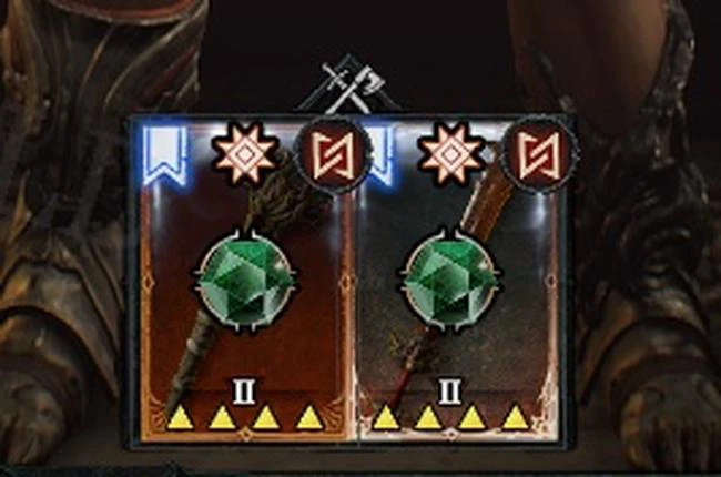
Despite the initial excitement, players soon noticed a significant drawback: the user interface (UI) became overly complicated. For instance, the UI clutter in the Armory system was highlighted through items like the one shared by Reddit user MntBrryCrnch. On his chest piece, there were a multitude of indicators including the Favorite bookmark, Greater Affix Indicator, two rune sockets, the new Armory Loadout symbol, the Transmog symbol, and the masterworking indicators—all contributing to a visually overloaded item interface.
Community Suggestions for Improvement
The Diablo 4 community has been vocal about the clutter issue and proposed several changes to declutter the item interface:
- Implementing auto-favoriting for items saved in the Armory, which would allow the Armory symbol to replace the current Favorite bookmark.
- Making socket indicators smaller or more transparent.
- Modifying the masterworking indicators to affect the item's border rather than using the current star system.
Despite these suggestions, the fundamental issue remains: systems designed to simplify the user experience are paradoxically making it more visually complicated instead of less so.
Comparative Insights and Potential Solutions
Looking at how other games have tackled similar issues provides valuable insights. For example, Path of Exile has a mechanism whereby item sockets are hidden until a player hovers over the item. Such a feature markedly reduces screen clutter. Furthermore, revising the presentation of Greater Affixes to modify the item's artwork itself—as seen in trading card games like those featuring Holo / Reverse Holo cards—could provide clear visual cues without additional icons.
Visual Enhancements and Game Mechanics
| Current Issue |
Potential Solution |
Example From Another Game |
| Overwhelming number of icons |
Hide icons until hovered over |
Path of Exile |
| Non-intuitive indicators on items |
Change item artwork to indicate special properties |
Trading Card Games |
| Excessive visual clutter affects gameplay |
Simplify and unify visual indicators |
General UI Design Principles |
Adopting such changes not only enhances the unique artwork and model of gear pieces in Diablo 4 but could also revitalize the enthusiasm when obtaining new items—similar to the exciting visual and audio cues in the game. More importantly, it would give Blizzard a chance to reclaim valuable UI real estate, potentially accommodating future updates or new features.
Conclusion
The recent enhancements to Diablo 4’s Armory system present both challenges and opportunities for improvement. Addressing the visual overload without compromising functionality is vital for the continued satisfaction and engagement of the game's players.
Looking to overcome these challenges and maximize your Diablo 4 experience? WowCarry’s Diablo 4 service is here to help. From expert guidance to efficient gear farming and build optimization, we’ll ensure you conquer Sanctuary with ease. Let us handle the grind so you can focus on enjoying the adventure. Contact us today and transform your gameplay experience!